We replaced 2 of the builder grade fixtures on the 2nd floor. But 3 was just too many. There was a hanging boob-shaped lighting fixture that Scott convinced me we should keep. I didn't want to keep it but I couldn't find anything I loved to replace it and I really hated to get rid of 3 perfectly fine lights. So, we settled on getting rid of 2 perfectly fine lights and spray painting the boob hanger to match the new lights.
Before:
After:
Doesn't it look nice with the banisters? Just you wait until you feast your eyes on how it looks with the other light fixtures. Prepare to have your mind blown! Imagine if we could only get a little paint up on the wall and some art. It would be too hot to handle; too school for cool.
Scott followed some on-line instructions for how to take down the light (I'm not recommending this... he is far from an electrician).
Here he is looking baffled:
We labeled pieces of taps and attached them to the wires so we would remember how they were attached. But then Scott spray painted and lost our precious information:
One tip for spray painting lighting fixtures is to make sure you spray paint all the tops of the screws and bolts that will be showing.
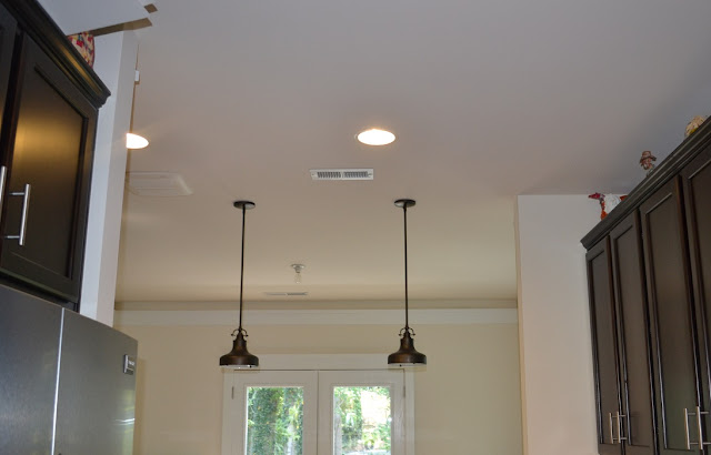
Right after we moved in, we had pendant lights installed (more on that here).

Did you notice our sweet sweet dining room chandelier in the background? Here is a close-up:
No, that was not a standard fixture. I wasn't wild about any of their chandelier choices so they were nice enough to leave me with "the bulb" and give me a little credit. I bought 3 or 4 chandeliers trying to find a perfect fit. Finally, I decided that a semi-flushmount ceiling light was the way to go because there was too much competition with the pendants. Also, we wouldn't have to worry about the semi-flushmount light being centered on the table or hanging the light too low and having it in our eyes or ducking around it to see the person across from you.
Here is how it looks now:
Now it is time to take a look at how all the lighting goes together. Sheesh this is an exciting post.
Pretend like you don't see the pictures on the wall in the background. I am going to introduce you to those soon.
And, now you know all you will ever need to know about our 2nd floor lighting!


I can't wait for your total reveal of how this all looks now, which is lovely btw!
ReplyDeleteIt looks beautiful! You really put a lot of thought into those lighting decisions. And it paid off!
ReplyDelete